Iconography examples
Icons are recognisable symbols customised from your brand for your users to identify and bond with. Good icons convey ideas without the need for text. Less text means less reading and that helps the users.
Icons using only three brand colours
I designed these icons for the services related to a product named TRACC. In order to retain the relationship visually across the many services, I limited the colours I used to the company's brand blue, gold and grey.
Click the images to enlarge them.
TRACC Portal
TRACC Reader
TRACC Maps
TRACC Workshops
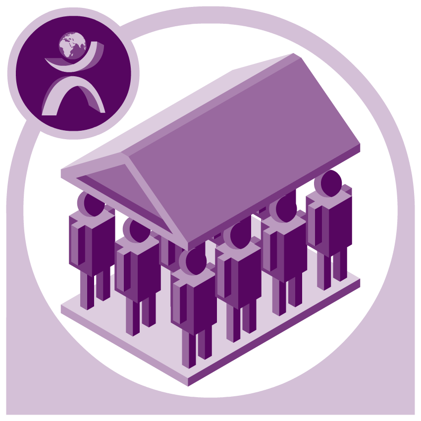
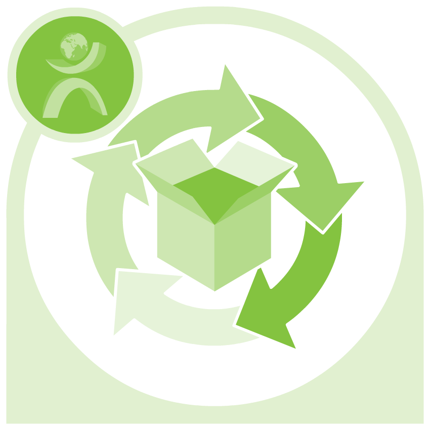
Icons using framing to create unity
While the company's colours where blue, gold and grey. Each of the TRACCs already had a designated colour. I used a shading technique to extract more variety from each of the colours, and I used a standard frame with a bleached-out TRACC logo to link all the icons as a family.
Click the images to enlarge them.
5S (Five S)
Asset Care
Environment, Health and Safety
Environmental Sustainability
Focused Improvement
Health and Safety
Visual Management
Demand Planning
Human Capital
Portfolio and Lifecycle Management
Transportation Management
Warehouse Management
Icons using auxiliary on-brand colours
The company's three colours had their limits when creating many icons. These icons’ colours were built off the auxiliary and contrast colours of the company's brand blue and grey. This created a secondary, but still on-brand colour palette, which was useful visual style for internal purposes.
Click the images to enlarge them.
Where to find it
Further Reading
Assesment
Give Feedback
Searchable Keywords
Find an Expert Tool
Recognition Tool
Value: Innovation
Value: Operational Excellence
Value: Shared Learning
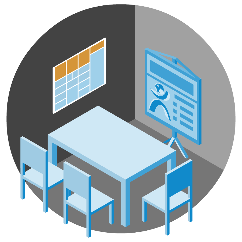
User interfaces examples
The user interface (UI) is the functional layer where your users engage with your website or app. A good UI helps your users get what they want quickly and without fuss, and sometimes even gives them access to features they didn’t even know they needed.
There's case study linked to this section:
View the Knowledge Central Case StudyCCI’s Knowledge Central
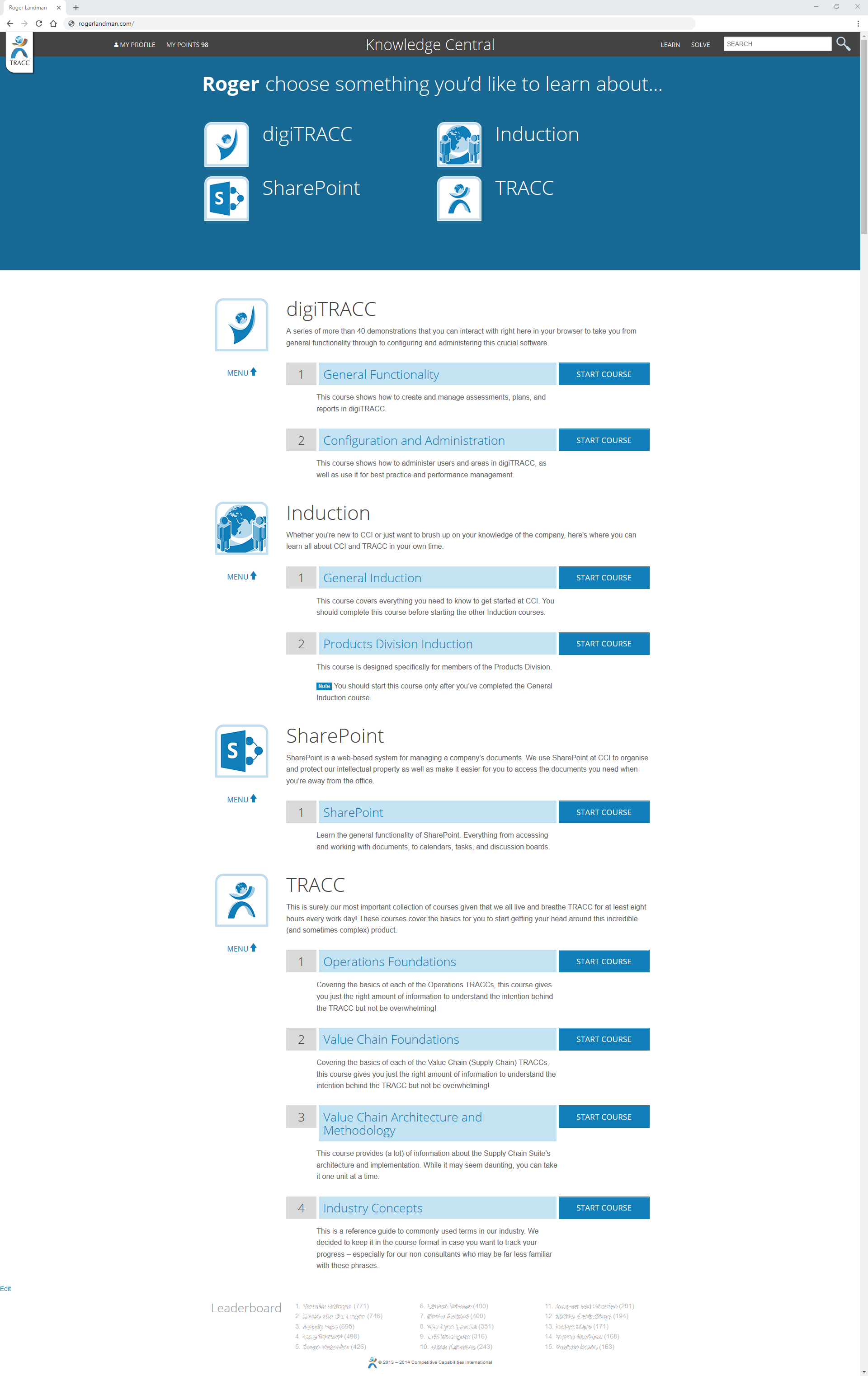
The Home page - Initially Knowledge Central’s home page only had a small number of focused functions. Over time we introduced UX testing, which led to a decision to morph the page to function more like a dashboard.

Before
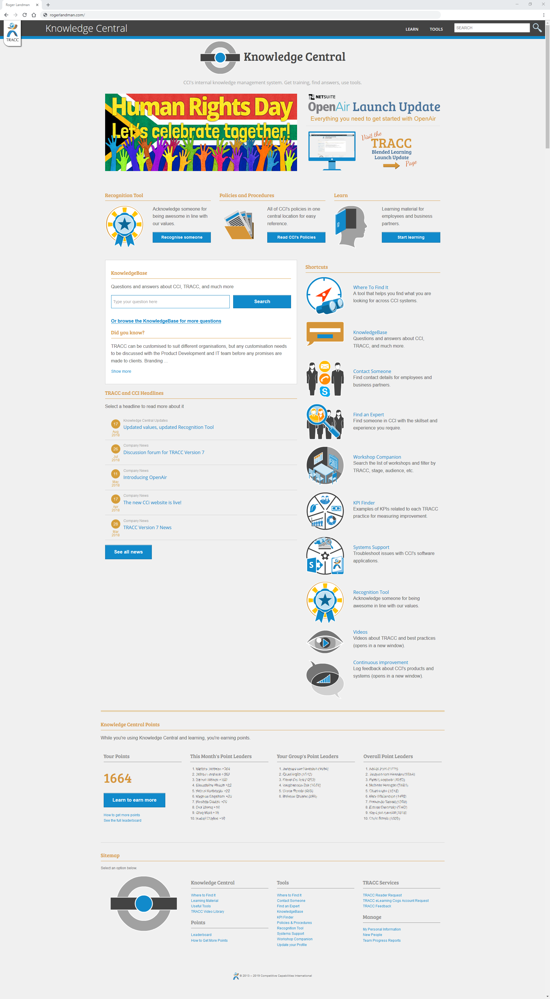
After
The Learn page - On this page, the users would select lessons to work through. A collection of lessons made up a module; in turn, a course was made up of several modules. The user could complete the course in any order, so we included a progress bar to help the user track their completion of each course; this was a big step towards motivating users to finish courses.
Before
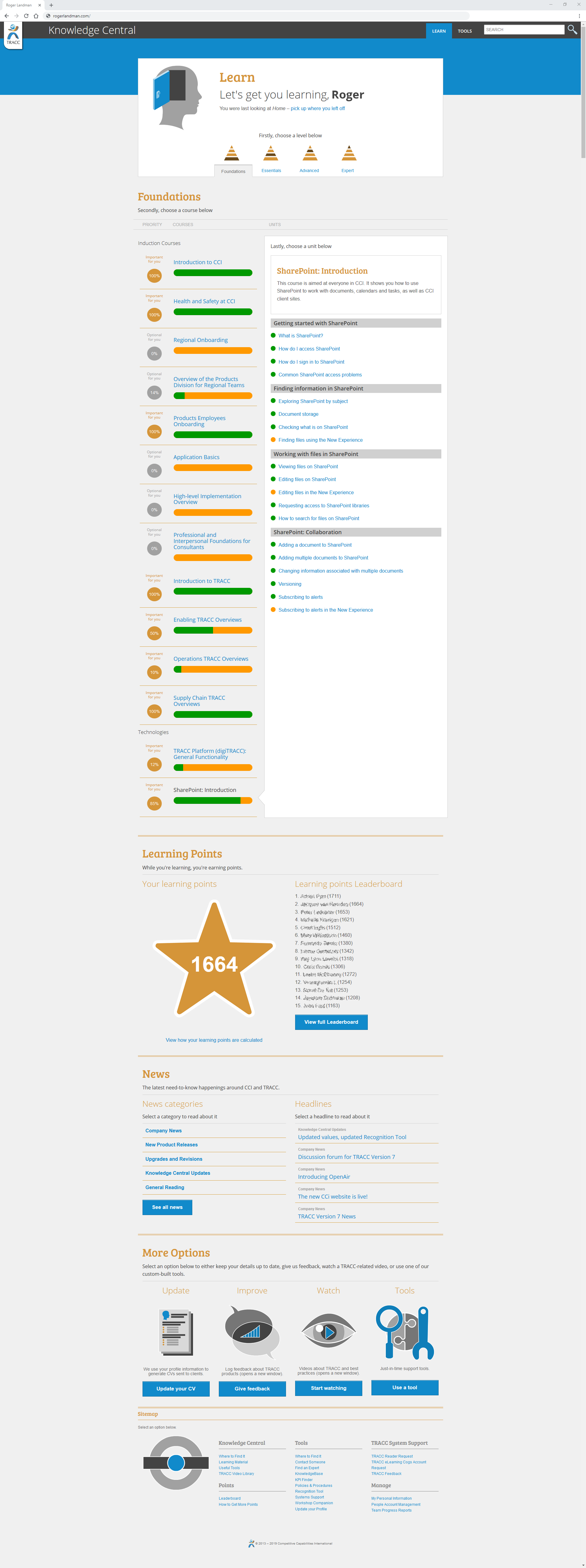
After
The Lesson page - The typical lesson page used to feel like a wall of text, despite being styled to the best practice at the time. By separating the text into cards and darkening the background slightly, the reading experience was more divided and this allowed the user to read for longer before fatigue set in.
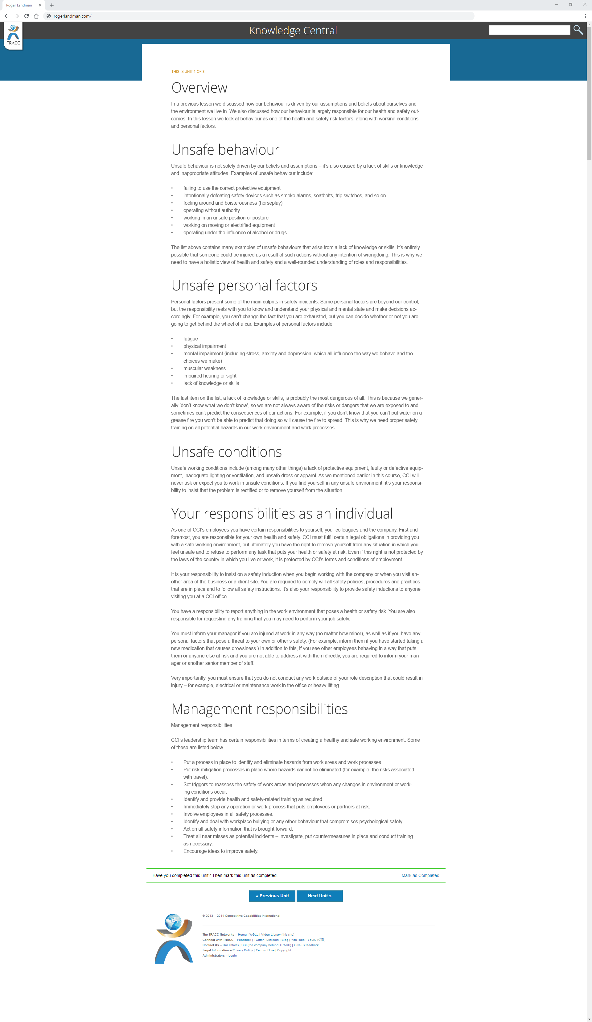
Before
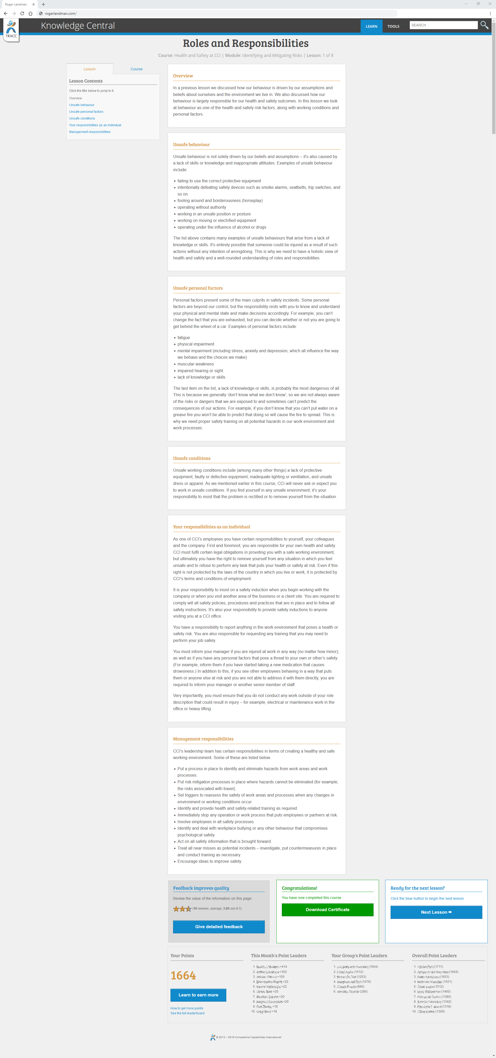
After
Please note: These images have been modified, by removing real people's names and adjusting size dimensions to be smaller.
For the full-sized images and more information, please view the Knowledge Central case study.
User experience evidence examples
User Experience (UX) is how your users experience your app or website. Good UX is invisible and frictionless, because if the user gets their expected outcome, they don’t care what happens in the background. I can't show you invisible examples, so here is the evidence I create by choosing how to make something invisible for your user.
There's case study linked to this section:
View the TRACC Explorer Case StudyCCI's TRACC Explorer
The feedback loop (Remixed) - The feedback loop is a model which capitalises on regularly capturing users input and then actioning it. I customised this model to explain to CCI stakeholders how I planned to implement UXD going forward.
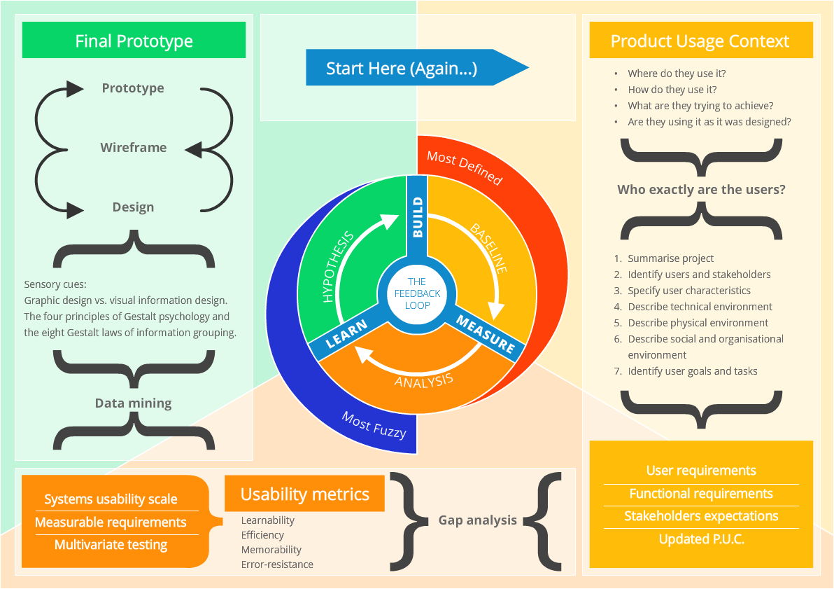
The feedback loop (Remixed)
System Usability Scale (SUS) - SUS is a standardised metric for gauging usability of an application. I added an extra layer displaying the tested user's computer skills and knowledge of the products, as well as their gender, in order to expose any potential patterns.
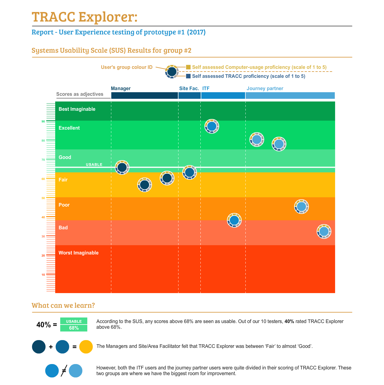
The results of a System Usability Scale (SUS) test shown to stakeholders
The UXD results in action - After doing the real world testing, working with the developers over video calls, and implementing my UI designs, we arrived at a new prototype that not only met round one of the users’ feedback, but was visually impacted from the UXD.
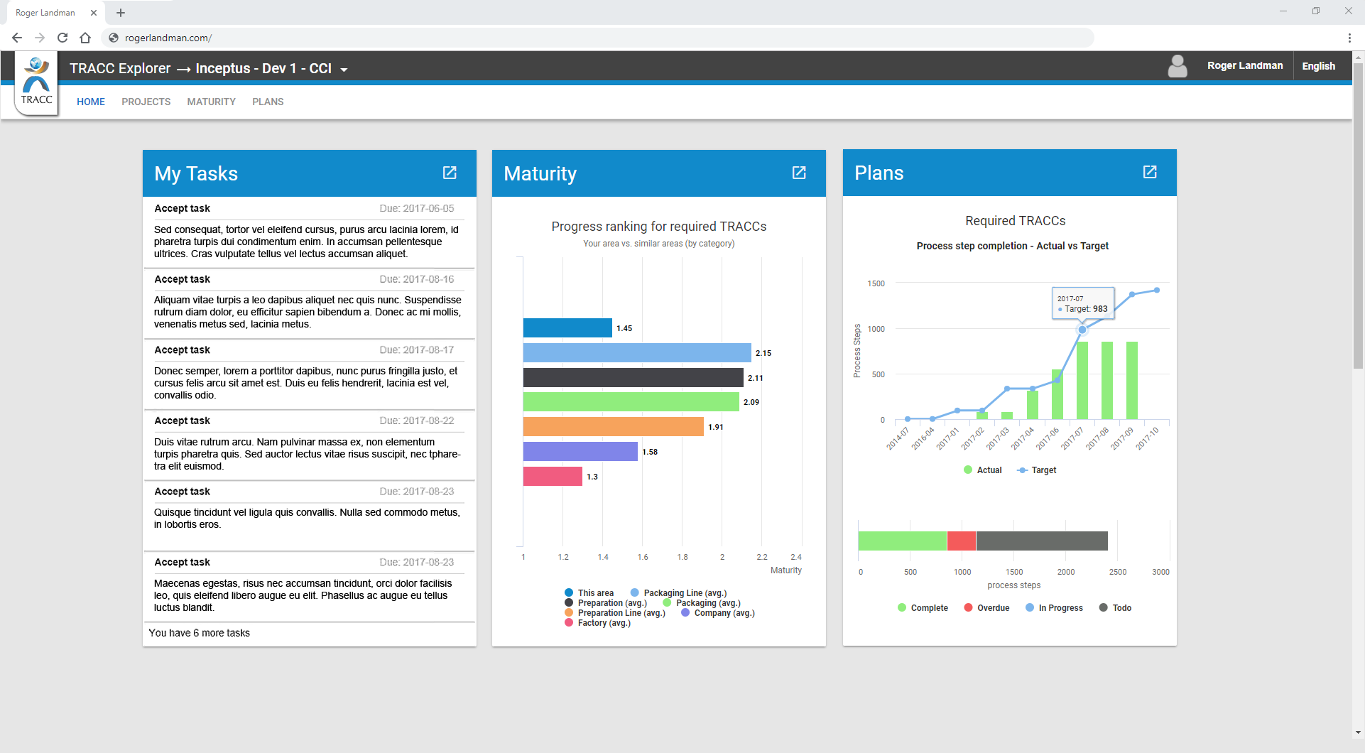
Before
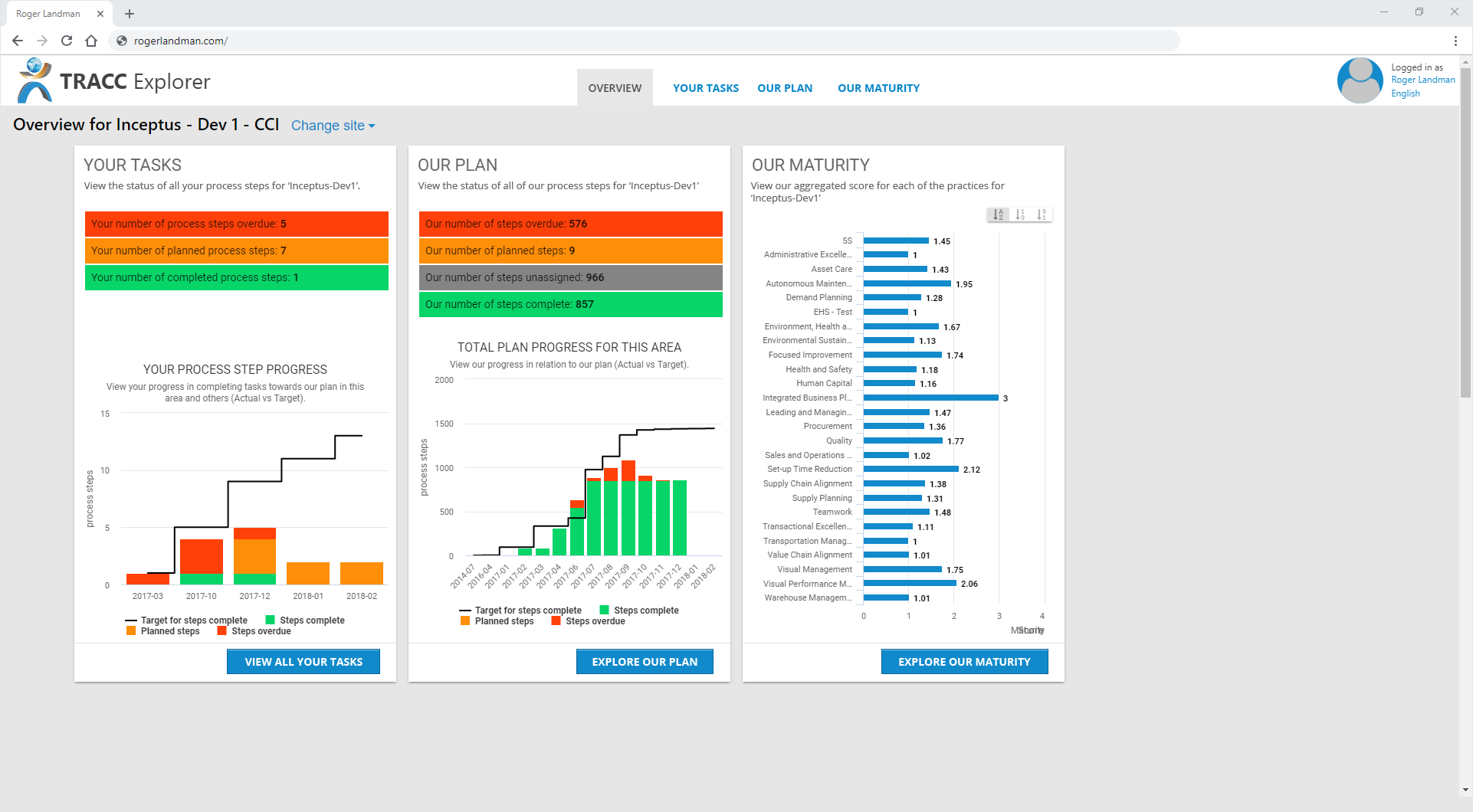
After
Please note: These images have been modified from their original state for size and intellectually property protection purposes.
For the full-sized images and more information, please view the TRACC Explorer case study.
Motion Graphics examples
Motion Graphics and Iconography - One of the advantages of having a library of icons is that you can add motion to them while a voiceover plays. The result will be a quick explainer video that uses images and words to get the idea across. Motion Graphics are short videos that highlight or focus-in on a specific aspect of your business, website or app. Good motion graphics use your icons (mentioned above) to explain complex ideas to your users in a friendly and simple manner.
CCI 2016 Vision
Press the play button to begin the video (2:41)
High-level Overview of TRACC - Introduction to TRACC
Press the play button to begin the video (1:25)
High-level Overview of TRACC - TRACC Platform
Press the play button to begin the video (2:18)
 Contact me
 Connect with me on Linkedin
 Chat with me on Twitter
 View my story artwork on Dribbble