If you’d like to get in touch after reviewing the case study, here’s how:
 Contact me |
 Connect with me on Linkedin
Roger the designer's case study of
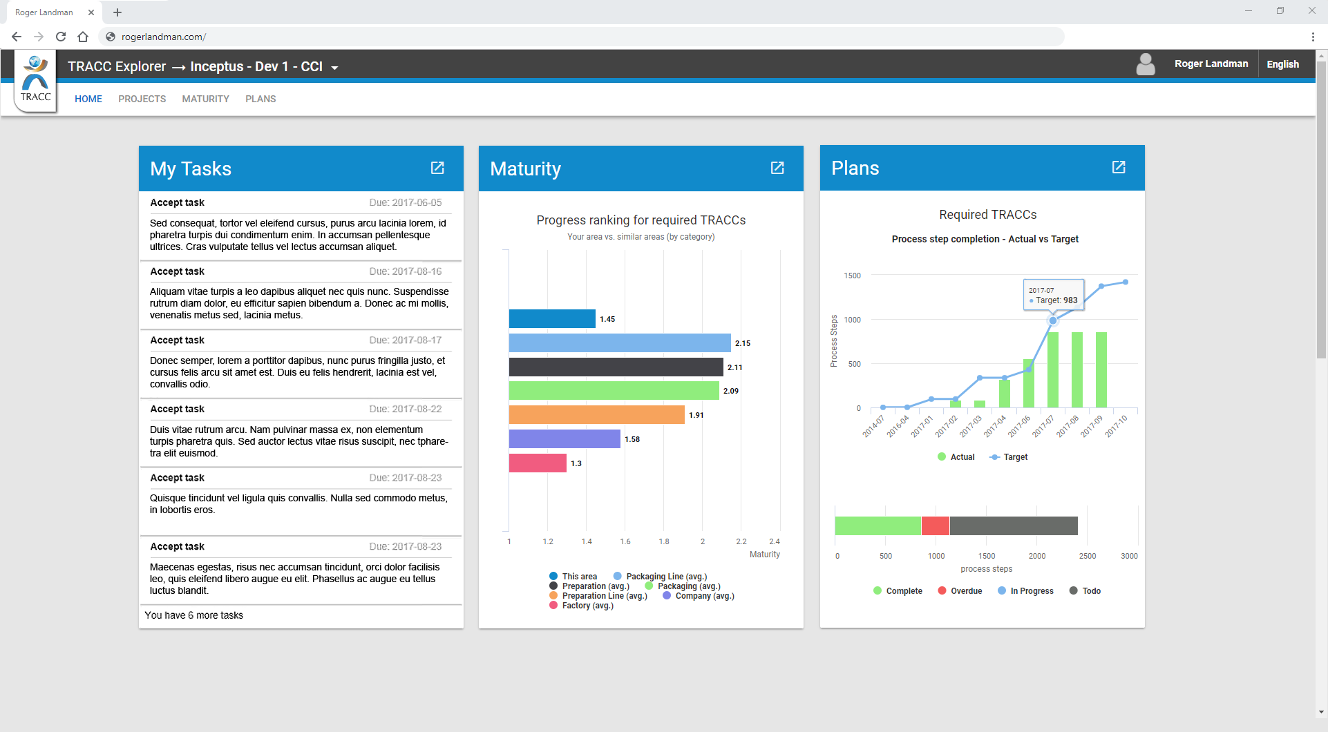
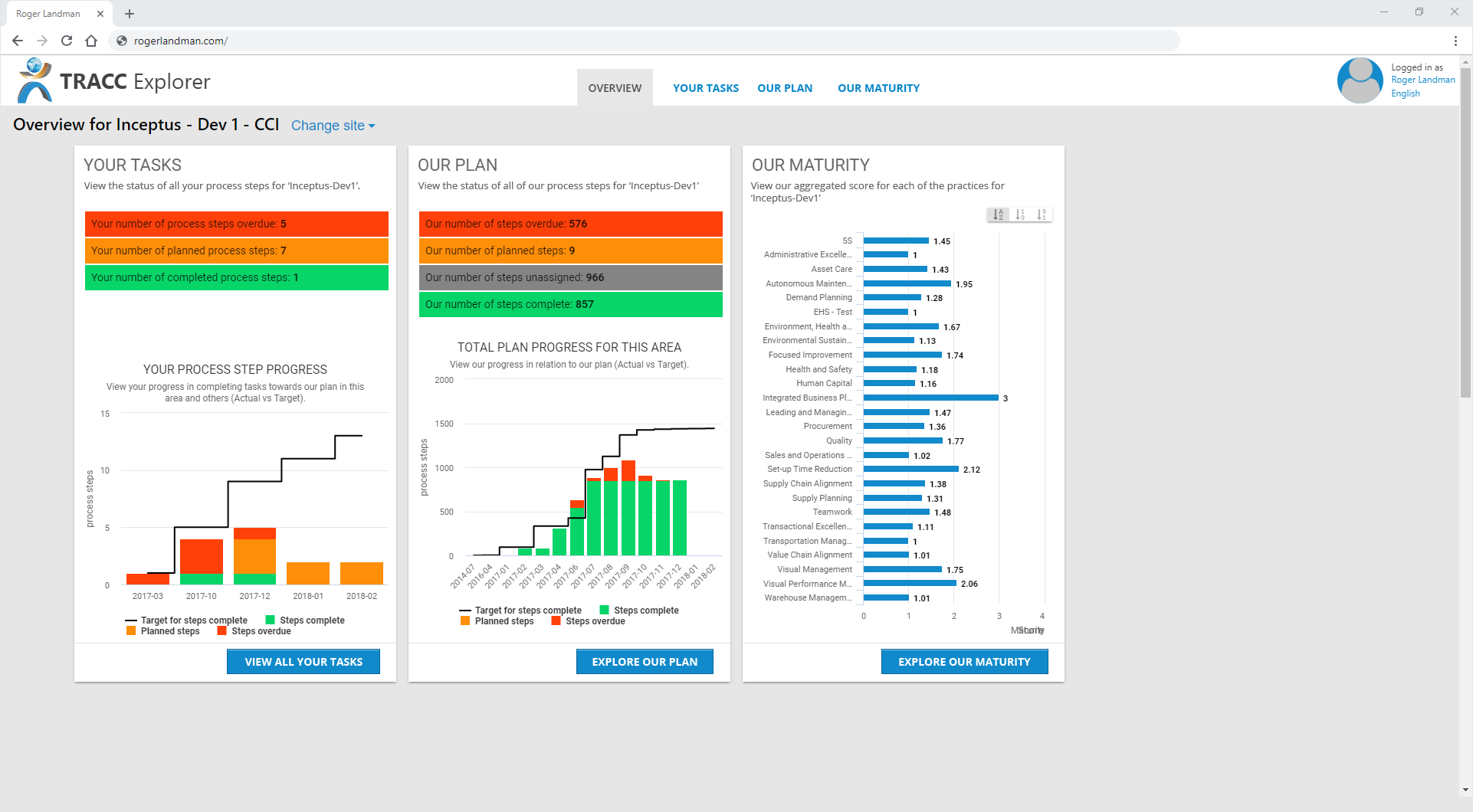
TRACC ExplorerTRACC Explorer (TE) is an online dashboard used to provide an overview of maturity scores (derived from multiple worldwide manufacturing sites) and to track individual users’ implementation tasks.
In this case study we’ll focus on the design disciplines of user experience (UX) design, and the user interface (UI) design. We'll also focus on what challenges arose, and what lessons were learned from each of the disciplines while working on TRACC Explorer.
I was brought into TE just before the delivery of the first prototype, the turnaround time for the whole UXD conducted was just over three months in 2017.
If you’d like to get in touch after reviewing the case study, here’s how:
Contact me |
Connect with me on Linkedin
User experience design (UXD) is where I become the living, thinking bridge between your users and your product, aiming to simultaneously better meet the user’s and business goals.
I aim to understand what the stakeholder's expectation are for the system; I engage with your users and understand their world; after that, I work with the teams behind the system to create as much of a win-win situation as possible.
User: What is TRACC Explorer?
Test TRACC Explorer with real-world users
I worked with the project manager and we contacted users locally and internationally to arrange interviews. For each of the 13 interviews that the project manager and I conducted, we filmed each user's screen and audio-recorded their verbal feedback. I wrote a questions sheet that asked the user to execute a set of basic TRACC Explorer tasks, providing one task per tile. I asked the user for a plus delta evaluation of their experience. I also asked basic empathy mapping questions to collect real-word data to be used for creating personas of potential TRACC Explorer users. Finally, I asked the users to rate TRACC Explorer on the System Usability Scale (SUS).
Please note: The actual text has been blurred out to protect the client’s intellectual property.
Click the images to enlarge them.
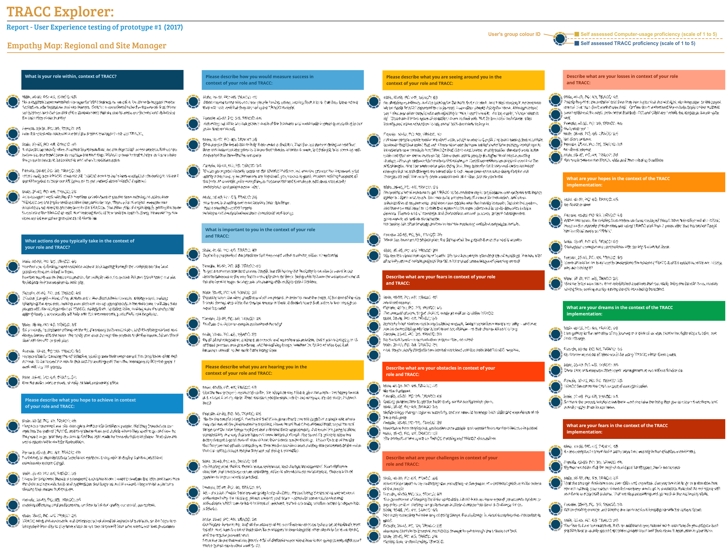
Results of empathy mapping, grouped by question.
User: You know what would work better...
Determine validity of user feedback suggestions.
The developer and I reviewed the feedback and worked together to create wireframes that mapped the user's journeys. We added or moved interactivity to meet the user expectations at the appropriate times. We standardised the visuals and the language. And we introduced a visual hierarchy that teams could follow in creating future versions of TRACC Explorer.
Click the images to enlarge them.

An early mock-up factoring in user's feedback

Discussing changes to an early wireframe concept
User: Will we do these feedback sessions more?
Give feedback to stakeholders about the success of the UX process in order to understand the quality of UXD going forward.
I presented the findings of the UX interviews to the stakeholders. To do so, I created visualizations of the SUS results and a thin-slice of the empathy mapping results. I also remixed the feedback loop to show how the development cycle could integrate UXD, and how the teams could use feedback from each new loop to continuously improve TRACC Explorer. This was how I imagined I could get to engage with users on a more regular basis.
Click the images to enlarge them.
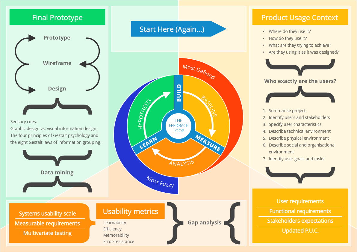
The remixed feedback loop model, with added details to explain the role of UXD going forward
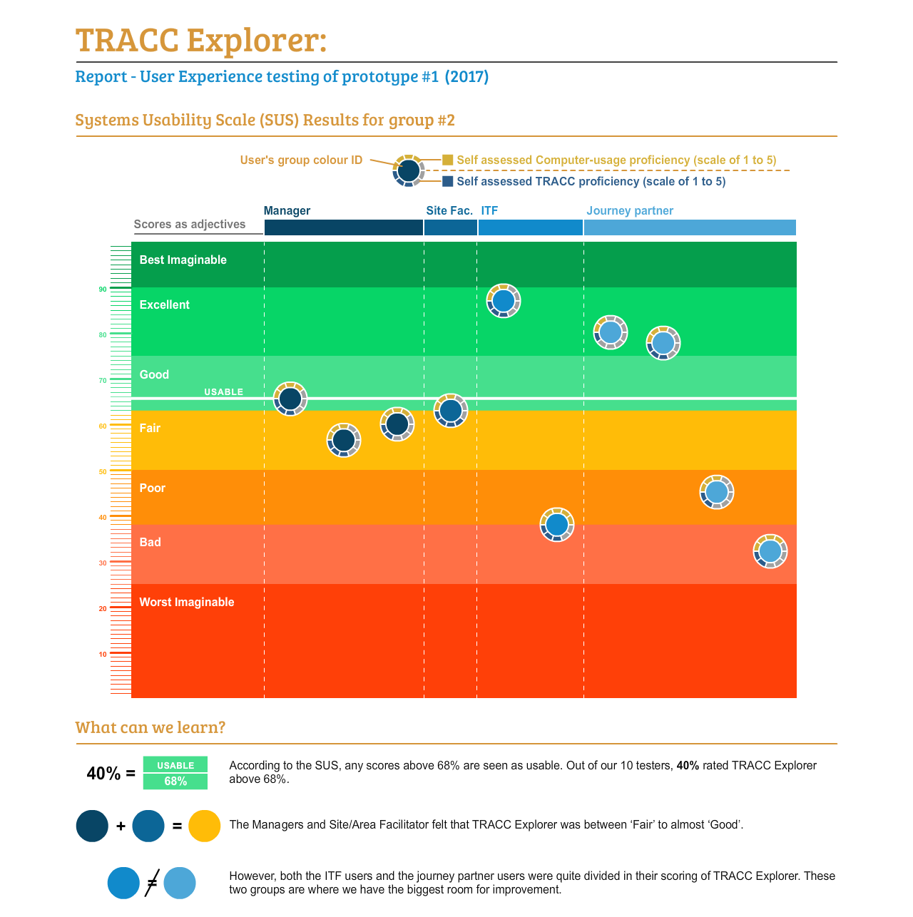
An example of the SUS feedback presented to the stakeholders
User Interface design (UID) is where I either fine-tune or overhaul your product’s interface, in order to remove friction for your users and prioritise your product’s useful features.
I aim to improve your interface bottlenecks in order to motivate and enable users to achieve their desired outcomes.
Align the UI with standardised guidelines
The initial layout and graphic design seen in prototype was clean and functional; it also looked very much like many other Google Material design applications. I used my experience of implementing visual hierarchy standards for the company on Knowledge Central to create guidelines that the developers could implement across all of TRACC Explorer.
This standardised the interactivity of TRACC Explorer and prioritised the correct information in the correct context for the user. I standardised the colours used in line with existing TRACC products. As a result of these changes, the user could identify which tiles required action and how to organically navigate the interface.
Please note: These images have been modified from their original state for size and intellectually property protection purposes.
Click the images to enlarge them.
Before
After
Improve the language of the UI.
In the first prototype, some of the interactivity used only basic standards of interactivity. We added instruction text to contextualise the user. We restructured the existing text to match the product language and make the application appear even more bespoke.
We also added “call to action” text for interactive elements. Ultimately this removed much of the guesswork users were doing in the interviews, and highlighted some of the more useful features of TRACC Explorer which previously were not obvious enough.
Click the images to enlarge them.
Before

After (Highlighted)
Improve the clarity of TRACC Explorer tiles.
Part of further clarifying the tiles was to label them correctly, and to use the same labeling logic across the variety of tiles. We identified which tiles were related to the company, and which tiles were important to the individual. We used the words “your” for individual focused tiles, and “our” for the company focused tiles.
Within those tiles we wanted to indicate which actions the individuals needed to complete urgently. We used coloured bars to indicate urgency and grab the users' attention. We compressed the task into a summarised number to shorten both scroll and the amount of information that needed to be processed.
Click the images to enlarge them.
Before

After (Highlighted)
One of the important technical specifications for TRACC Explorer was that it was developed for mobile first. This meant that it inherited its styling from Google Material design, so the team had to dedicate a fair amount of conscious thinking to ensuring that TRACC Explorer looked unique, unlike other apps that used the same framework.
UXD is a relatively new field in some organisations, which creates a lot of expectation to deliver evidence that UXD works and to communicate that evidence in a way that makes sense to stakeholders and potential objectors. The stakeholders at CCI were curious and excited for the result of the UXD, so the experience of sharing the evidence with them was a pleasant one.
However, by the time I was brought in to the project, a lot of the major functionality was set in stone. So while the user feedback reveals potential big wins, I did not have the scope to implement the changes and monitor the impacts. Again, this really highlighted for me how starting UXD early can save you money and time in the long run.
Practicing UXD in small pocket-projects or in theory is wonderful, because there are few restrictions or none at all. But with TRACC Explorer I had to install many different video conferencing apps and coordinate with people across time zones. These tasks added up and required a lot of time and planning, and that’s before the actual UXD even starts!
I used to think UXD was all about the user, but the more I practice, the more I see the stakeholder comes first. Without the stakeholder and their product, there are no users to work with. It is just as important to understand the stakeholders and ensure that their strategic goals are being met as it is to understand and address the users’ needs.
TRACC Explorer presented the full spectrum of UXD, from writing questions to working with users, analysing data, creating wireframes, and designing mockups. It was a truly enjoyable and educational experience, one that I’m happy to repeat for every UXD project in the future.
Roger worked with us on the TRACC Explorer project for CCi. His work involving user interviews, UX and interface design was invaluable to the success of the project. He has a high level of experience and knowledge regarding UX processes as well as design and this helped us to design and build a product that wasn’t just functional but one that people were excited to use because it added great value to their everyday processes.
Roger has a really positive attitude and effect on the people that he works with and is a great team player. I am really grateful to have had him on my team during this development process and would be more than happy to fully recommend his services. Alun Tucker – Technical Projects Manager and Business Analyst for CCi